

MyProjects
File
Edit
Search
Help
Address

C:\Maryam\Portfolio\Projects.exe
ShiftFlow
Ai Shift Planner
(UX Project)
WorkBowl
Healthy Food App
(Food Ordering UX)
Lolly Abaya
Fashion Brand Website
(Fashion E-commerce UI)

Back

Forward

Up
Cut

Copy
Paste
Undo
Delete
Ready

Project 3 of 3

My Projects

Notepad.exe


10:36 PM
File
Edit
Search
Help
Lolly Abaya - Fashion Brand Website
Lolly Abay
a

Luxury Abaya Brand Website
A luxury abaya brand website created for a UAE based client.
The project combined branding, web design, and interactive shopping experiences to bring the brand vision to life.

PROJECT OVERVIEW

Role
UX/UI Designer
Brand Designer
Platform
Website
Tools
Figma, FigJam
ChatGPT
Notion

Duration
4 Weeks
Focus
Brand Identity & E-commerce Experience
PROJECT OUTCOME
Strong Brand Identity
Created a cohesive visual direction, logo, and website experience that reflected the client’s feminine brand vision.

Clear Shopping Journey
Designed a simple browsing and checkout flow that made products easy to explore and purchase.

Distinctive Visual Experience
Used interactive elements and custom visuals to create a memorable shopping experience.
Launch Ready Foundation
Delivered a complete website prototype ready for future development and implementation.
CLIENT DISCOVERY & DIRECTION
Before starting the design process, I had several discussions with the client to understand the inspiration behind the collection, the emotions she wanted the brand to communicate, and the overall shopping experience she envisioned.
These conversations helped guide the visual direction and many of the UX/Ul decisions throughout the project.
Client meetings
THE GOAL
Create a website experience that reflects the vision behind the client's abaya collection
Design a visually engaging e-commerce experience that feels elegant and memorable
Balance aesthetics with usability without making the interface feel overwhelming
Create a smooth and user friendly shopping and checkout flow
Maintain a consistent visual style across all pages while keeping the luxury feel of the brand
CHALLENGES

Combining multiple design inspirations into one cohesive website experience without making the interface feel cluttered

Translating the client's collection concept into a clear and cohesive website style
Keeping the design consistent across all pages while balancing creativity with usability
Designing product and collection pages that still felt visually engaging without overwhelming the shopping experience
MOODBOARD & VISUAL DIRECTION
The visual direction focused on creating a soft, vintage inspired shopping experience that matched the mood of the client's collection.

Soft luxury aesthetics
Vintage letters and stamps
60s fashion editorials
Romantic textures and typography
Classic
old Hollywood glamour
BRANDING & LOGO DESIGN
The client wanted the brand to feel soft, feminine, and handwritten while maintaining an elegant luxury aesthetic.

#610E15
#D2B99E

Client’s initial logo idea

refined typography
+
improved spacing and elegance
UX / UI DECISIONS
Communicating the Brand Identity Clearly
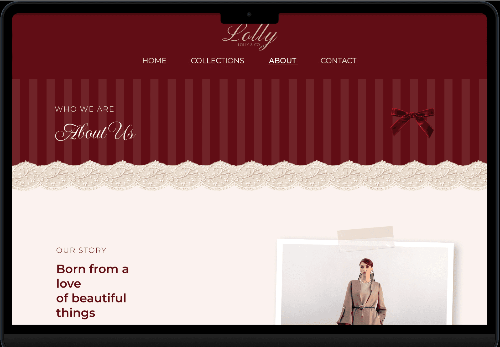
The homepage was designed to immediately introduce the mood of the brand while keeping the navigation simple and easy to follow.
Improving Product Browsing
Product images zoom in on hover. This helps users preview details easily and quickly before opening the product page and making browsing feel more interactive.
Creating a More Engaging Subscribing Experience
Instead of using a standard subscribing input field, I designed an interactive envelope animation that opens on hover and reveals the email subscription field underneath. This was added to make the experience feel more playful and memorable.
Simplifying the Shopping Flow
The ordering process was designed to feel clean and straightforward by using clear steps, organized layouts, and minimal distractions throughout checkout.


Maintaining Visual Consistency Across Pages
A softer and more minimal layout system was used on the inner pages to keep the experience visually balanced while still connected to the homepage identity.


REFLECTION
Learned how to balance strong visual direction with usability while designing around a client’s vision.

Biggest challenge was combining multiple creative inspirations into one cohesive direction without making the interface feel cluttered.
Explored interactive elements such as hover interactions, animated components, and moving banners to make the shopping experience more engaging.
NEXT STEP

Develop the website from prototype to production.
Implement animations and micro interactions.
Conduct usability testing with real users.
Gather feedback after launch.
Refine the experience based on user insights.

PROJECT RESOURCES
View Interactive Prototype
High-fidelity prototype (Interactive in Figma)


